Introduction
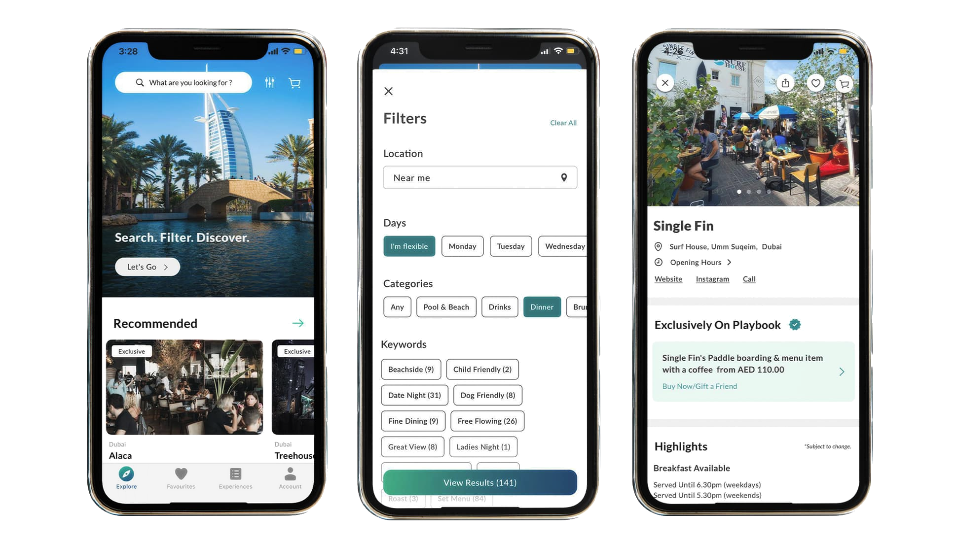
Playbook is an app that displays the current happenings all around Dubai,
Abu Dhabi, and London. It targets users who are looking to attend various events such as live shows, quiz
nights, or other forms of entertainment.
The platform offers a home page containins popular venues and reviews
ranging from "Iftar spots this Ramadan
at Expo City" to "Smash it at Club Padel's Trading Tournament!" Needless to say, the platform offers
everything you need to know about events going on in the UAE.
Strong design choices
- The site only requires a single touch to access reviews (through the “Latest
Stories”
button in the menu bar). This enables easy navigation between functions of the platform, leaving users content
with their experience
- Playbook has a ery straightforward layout, requiring only one click to access a
page, not requiring any extra clicks or pathways to access content, such as logins or cookies.
- There is an ideal mix of text and images in the website. The layout is also neat,
organized, minimalistic, modern, and not crowded. This makes the page
clearer and easier on the eyes for the user.
- Good use of headings to attract and gain the attention of the user
- Good idea to put the information regarding the events below the image
- Good use of option boxes on the home page to be able to select one or more
categories.
Weak design choices
- In the review page, perhaps there could be a shortcut below the title with a
“contents” kind of thing where there
are the headers in a smaller font, and users can click the shortcut to access the events that interest them
from the
headings. alternatively, there could be a search button to search for events, although this is gives the
opportunity for
open-ended searches (unlike options in the contents) which may be redundant if users cannot find an event
taking place
that month (be it because we haven’t written about it, or because it doesn’t exist at all).
- When scrolling down through a review, there could be a little button that pops up
on top to go to the top of the page,
especially for long articles like the “things to do this march” one.
- Perhaps there could be a “back” button to access the page that the user could
press to access the page they were looking at previously. although search engines already have this, it’s
important for a website to be able to direct the user through all contents of the website. a back button would
make the page more straightforward for the user to go back to their previous page once they’re done reading an
article to encourage them to read another one.
- On the menu (on article pages), there could be another button that just says
“articles”. below this, it could be a dropdown or just a button, but it can display all the articles/blogs
written.
- To establish ethos, there could be a section for user reviews. this could be a
page (not recommended, it is unlikely for a user to access a page just to check reviews for an app) or a
little segment just above the page footer.
Target audience
According to Sprout Social (2023), 77% of internet users aged between 15-35 have a
YouTube account, as well as 73% of users on the internet aged between 36-45, 70% from 46-55, and 67% of those aged
56+. From these statistics, we can see that YouTube is more popular amongst the newer generation (particularly Gen
Z), which is not a surprise, as most of YouTube's top creators became popular during their childhood. In fact,
HubSpot Blog claims that 96% of Gen Z users (born in 1997-2012) have an account on the platform.
Another statistic is that 82% of YouTube users are above the age of 18 (according to
Global Media Insight), demonstrating that almost 1 in 5 users are either very young Gen Z people or those of
Generation Alpha. Regardless, it can be concluded that younger ages are more prevalent on the platform. This is
why creating another app – "YouTube Kids – was a much-needed idea for YouTube's younger audience.